Exploring Oil and Gas Wells in Texas
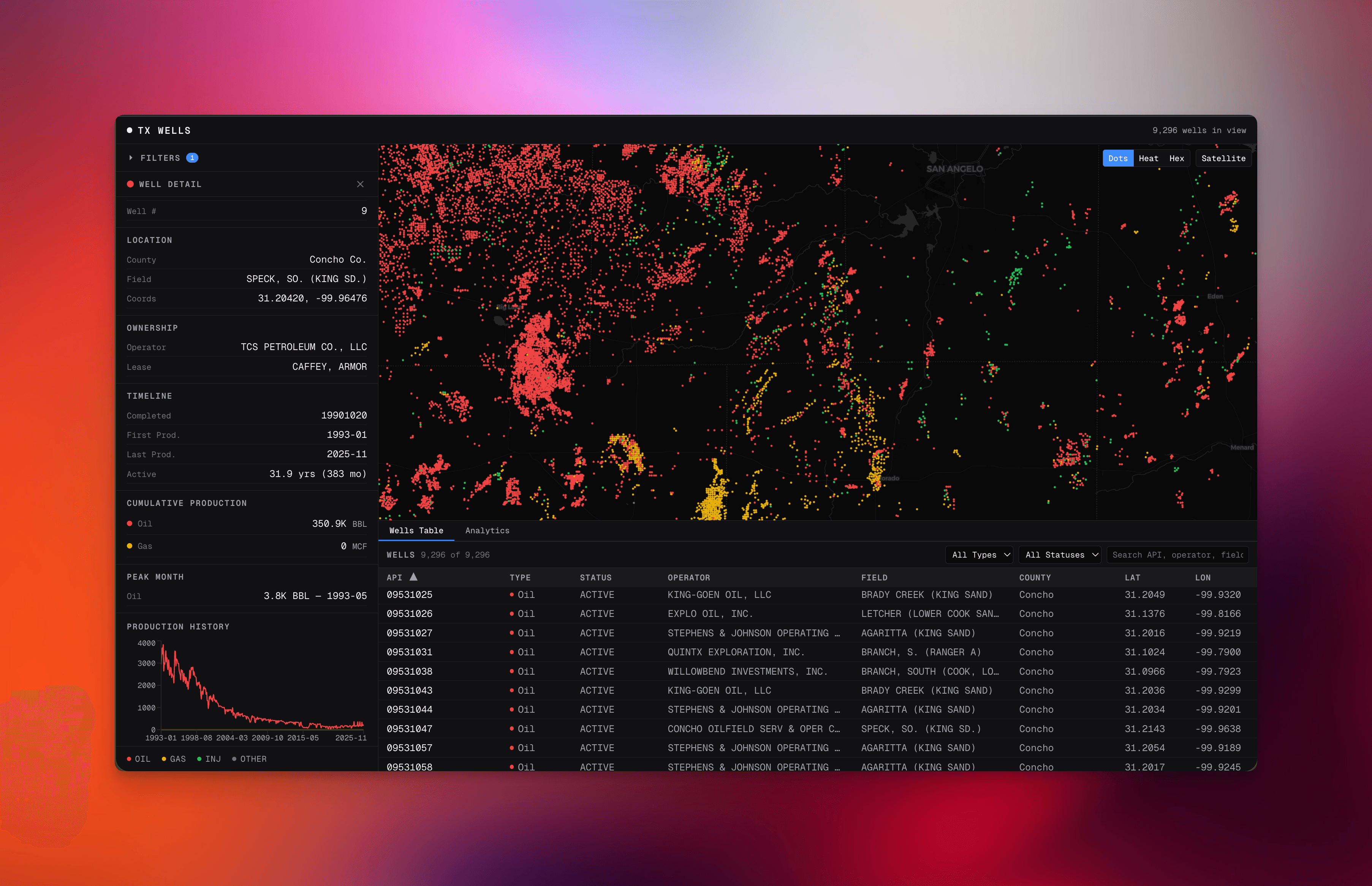
Texas has hundreds of thousands of active oil and gas wells. I built an explorer that lets you pan, filter, and drill into every single one of them, and the map still feels instant.
This post breaks down how that actually works: how regulatory data becomes queryable, how the API knows what to send at each zoom level, how the UI stays responsive under pressure, and why the whole thing doesn't collapse under its own weight.
The code is on GitHub.
Why This Is Harder Than It Looks
On the surface, it's a map with dots. But there are three constraints that make it a real engineering problem:
- The source data is a mess. Texas regulatory data arrives in DBF files and pipe-delimited CSVs. You can't query it directly. You have to clean it, normalize it, and load it into something useful before you can do anything.
- The data volume changes dramatically. Zoomed out to see all of Texas? That's hundreds of thousands of points. Zoomed into a single county? Maybe a few hundred. You can't query and render these the same way.
- The frontend can't wait. If the user pans the map and has to wait 3 seconds for data, the experience is dead. Backend query behavior and frontend rendering have to be coordinated.
Every architectural decision in this project comes back to one of these three problems.
Ingestion: Turning Regulatory Data Into Something Useful
The ETL entrypoint is scripts/build-data.ts. It does four things:
- Reads county DBF files to extract coordinates and metadata.
- Normalizes API identifiers (the unique well IDs) for stable joins.
- Merges spatial records with well attribute records.
- Loads everything into DuckDB tables.
Here's the coordinate extraction:
const lat = rec["LAT83"] as number;
const lon = rec["LONG83"] as number;
const api = normalizeApiNumber(String(rec["API"] ?? ""));
const symnum = (rec["SYMNUM"] as number) ?? 0;

coordMap.set(api, {
  lat: Math.round(lat * 1e6) / 1e6,
  lon,
  symnum,
  countyCode,
});
That normalizeApiNumber call looks minor, but it's one of the most important lines in the entire codebase. API numbers are the primary join key across every table. If two sources format the same well ID differently, like 42-001-12345 vs 4200112345, your joins silently produce wrong results. No errors. Just bad data in your charts and filters. Normalizing at ingestion means every downstream query can trust the key.
The same script pre-computes a lease name join key for production data:
CREATE TABLE production AS
SELECT *, UPPER(TRIM(LEASE_NAME)) AS lease_name_upper
FROM read_csv('Production_Table_Year1985_To_Current_DSV.txt', header=true, delim='}')
Yes, the delimiter is }. Welcome to Texas regulatory data.
Doing this at ingestion time means we never have to apply UPPER(TRIM(...)) at query time.
Database: One Query Path, Two Environments
Database initialization lives in src/lib/motherduck.ts.
The connection strategy is simple but deliberate:
const connStr = token
  ? "md:texas_wells?motherduck_token=" + token
  : path.resolve(process.cwd(), "data/texas_wells.duckdb");
If there's a MotherDuck token, connect to the cloud. If not, use the local DuckDB file. Same queries, same schema, same code path.
The API: Sending the Right Amount of Data
This is where it gets interesting. The primary endpoint is src/app/api/wells/route.ts, and its behavior adapts to what the user is actually looking at.
The core mechanism is dynamic row limiting based on zoom level:
if (zoom < 7) limit = 10_000;
else if (zoom < 9) limit = 20_000;
else if (zoom < 11) limit = 40_000;
else limit = 80_000;
Why? Because when you're zoomed out to see all of Texas, rendering hundreds of thousands of individual dots is pointless. You can't distinguish them anyway. 10,000 sampled points give you the same visual at a fraction of the cost. But when you're zoomed into a single county, you want every well, so the limit opens up.
The route stacks additional optimizations at low zoom levels:
- Sampling for very wide views, so you're not transferring data the user can't see.
- Reduced column projection, because you don't need 20 metadata fields to render a dot.
- Coordinate integer encoding to shrink payload size.
For production data, the endpoint in src/app/api/production/route.ts joins wells to monthly production rows:
SELECT p.CYCLE_YEAR, p.CYCLE_MONTH,
       p.LEASE_OIL_PROD_VOL, p.LEASE_GAS_PROD_VOL, p.LEASE_COND_PROD_VOL
FROM wells w
JOIN production p ON w.lease_name_upper = p.lease_name_upper
WHERE w.api_number = $1
ORDER BY p.CYCLE_YEAR, p.CYCLE_MONTH
This is where that pre-computed lease_name_upper key pays off. The join is clean and fast because normalization happened once, at ingestion.
Rendering: GPU-Accelerated Maps With Deck.gl
Map implementation is in src/app/components/Map.tsx.
Deck.gl handles the heavy lifting through interleaved overlay rendering:
const overlay = useControl(() => new MapboxOverlay({ interleaved: true }));
overlay.setProps({ layers });
The component supports three visualization modes, each useful for different questions:
- Scatter mode for inspecting individual wells. Click a dot, see its details.
- Heatmap mode for spotting density patterns. Where are wells concentrated?
- Hex aggregation mode for understanding regional structure. How does production cluster across areas?
But here's the subtle part: what happens when the user is rapidly panning the map? Every viewport change triggers a new API request. If the user pans three times quickly, you get three in-flight requests, and the responses might arrive out of order. The map would flicker between states.
The fix is request cancellation:
abortRef.current?.abort();
const controller = new AbortController();
abortRef.current = controller;
Every new viewport change aborts the previous request. Only the most recent one completes. No flickering, no stale data, no jitter.
The UI: Making Dense Data Feel Lightweight
The layout is a three-pane dashboard: a sidebar for filters and well details, the map taking up the top portion, and a tabbed bottom panel for the data table and viewport analytics. Everything runs on React 19 with a dark theme built on CSS custom properties in Tailwind v4.
Coordinate Compression
The server doesn't send raw floating-point coordinates. It packs well data into compact arrays and multiplies coordinates by 1e5 to send integers instead of floats:
// Server sends: [api_number, lat*1e5, lon*1e5, type, status, operator, county_code, field_name]
// Client decompresses:
lat: raw[1] * 1e-5,
lon: raw[2] * 1e-5,
This cuts JSON payload size significantly. Floats like 31.947281 become integers like 3194728. Multiply by thousands of wells per request and the savings add up.
Deferred Rendering With useDeferredValue
The page-level state management in src/app/page.tsx uses React 19's useDeferredValue to keep map interactions smooth:
const [visibleWells, setVisibleWells] = useState<WellDotPublic[]>([]);
const deferredWells = useDeferredValue(visibleWells);
When the user pans the map, visibleWells updates immediately. But the data table and viewport analytics receive deferredWells, which React updates at lower priority. The result: panning the map never stutters, even though the table below is re-rendering thousands of rows. The map and the table update independently, and the map always wins.
Hand-Rolled Row Virtualization
The data table in DataTable.tsx doesn't use a virtualization library. It calculates visible rows from scroll position:
const ROW_HEIGHT = 28;
const OVERSCAN = 10;

const startIdx = Math.max(0, Math.floor(scrollTop / ROW_HEIGHT) - OVERSCAN);
const visibleCount = Math.ceil(containerHeight / ROW_HEIGHT) + OVERSCAN * 2;
const endIdx = Math.min(filtered.length, startIdx + visibleCount);
const visibleRows = filtered.slice(startIdx, endIdx);
Only the rows in the viewport (plus 10 rows of overscan on each side) are rendered. The rest are empty space. This means scrolling through 80,000 well records feels the same as scrolling through 50. The browser only ever has ~60 DOM rows at a time.
Production Charts With Client-Side Caching
When you click a well, WellPanel.tsx fetches its monthly production history and renders it with Recharts. But if you click the same well twice, it shouldn't hit the API again. A client-side Map handles this:
const productionCache = new Map<string, ProductionRow[]>();

useEffect(() => {
  const cached = productionCache.get(well.api_number);
  if (cached) {
    setProduction(cached);
    return;
  }
  // Fetch, then cache the result
}, [well.api_number]);
The chart itself renders oil, gas, and condensate production as separate lines, with condensate only appearing if any month has non-zero values. No wasted visual space for wells that don't produce condensate.
Viewport Analytics
There's a second tab alongside the data table: ViewportAnalytics.tsx. It computes live statistics from whatever wells are currently visible on the map, including well type breakdown, top operators, and top fields.
This component also uses useDeferredValue internally, so the analytics recalculate without blocking map interactions. Pan to a new area and the stats update to reflect exactly what you're looking at.
Tying It Together
The interesting part of this project isn't any single technique. It's how the layers reinforce each other. Normalized keys at ingestion make queries simple. Zoom-aware endpoints keep payloads small. Compressed coordinates and hand-rolled virtualization keep the browser lean. Deferred updates let the map and table stay out of each other's way. Request cancellation prevents stale data from showing up.
Take any one of these out and something breaks. Skip key normalization and your joins return wrong results. Skip request cancellation and the map flickers. Skip virtualization and the table chokes on 80,000 rows. They work because they're consistent across layers, not because any individual piece is clever.